


Today in England over a quarter (27 per cent) of households are poor, meaning that they are unable to take part in the norms of society, they are unable to purchase items which the majority of the population consider to be necessities and, very often, their children are unable to take part in relatively cheap school trips or have a birthday party because of lack of money. In recent years that proportion has been rising. These rises that have been documented in great detail by the UK government funded Economic and Social Research Council’s Poverty and Social Exclusion team.
Just under a quarter (24 per cent) of all households in England are rich, meaning that if all their members were to die today their estate would probably be subject to inheritance tax. That proportion of people does not actually pay inheritance tax on death because they tend not to die young and they spend or transfer most of their wealth in old age; but at any one time roughly a quarter of the population is wealthy. That proportion has been rising slowly in recent years, primarily because of rises in property prices in the South East of England.
These changes mean that nationally, for the first time ever, a minority of households in England (48 per cent) are neither rich nor poor according to these definitions of poverty and wealth. In the early Eighties some two thirds (66 per cent) of households were in the middle, were neither rich nor poor in England.
The economic polarisation that has resulted in such great divisions has been most pronounced in London where the proportion of households who are neither rich nor poor has fallen to 37 per cent most recently and is almost certainly continuing to fall. Some 36 per cent of London’s households are now poor and just 27 per cent are wealthy. The proportion that is wealthy within London is this low because relatively few householders in London own their home outright or have paid off a substantial proportion of their mortgage.
In 1983 poverty researchers in Britain pioneered the measure of a poverty threshold where a household was defined as poor if they lack necessities because they can’t afford them. What is deemed to be a necessity changes over time but the measure remains the same – a household is poor if it cannot afford necessities – and the population of the country is periodically surveyed to assess those goods and services that a majority consider to be necessities.
Poverty surveys were conducted in 1983, 1990, 1999 and 2012. These surveys have reported a growing number and proportion of households unable to afford basic items considered by most people to be necessities. The latest report for example found that in 2012, about 12m people could not afford one or more household goods that are now seen as essential, like a mobile telephone (cheaper than a landline), washing machine or that they could not afford to replace or repair broken electrical goods. In 1999, that number was about 8m; in 1990, about 6.5m; and in 1983, nearly 3.5m people. The goods that were seen as essential changed over time but the number who could not afford those goods rose as social inequalities widened.
Before the most recent poverty survey and census, and in collaboration with many colleagues from different universities we combined data from poverty surveys with census data to estimate the proportion of households in each small area of the country who were poor. The results of that study were published by the Joseph Rowntree Foundation in 2007 and also included a method for estimating how many households in each area were wealthy (defined as having equity in the housing they owned or were buying that exceeded current inheritance tax thresholds). Recently we have updated that work using the 2011 census to present a contemporary picture and a long-term indication of changes over the generations.
The figures and maps we have produced will underestimate the current extent of poverty because we are applying the equations produced in the 2007 Rowntree report to 2011 census data. We know that average incomes have fallen, that benefits have been cut that there have been many other detrimental changes since 2011, but the figures here provide the best picture we can currently produce of the geographical distribution of poverty and wealth which can be compared to the past. The estimates by wealth are far more up-to-date as we can use current house price data to update them. However even then house prices have been rising rapidly in much of South East England and so again we will have underestimated the current extent of social polarisation.
Below we refer to the years being mapped as 1980, 1990, 2000 and 2010 because we are mixing data from around and just after each of those years to produce the estimates. For the wealth estimates housing price data from 2011 was used. We rely on census data to update the estimates of both poverty and wealth as only the census tells us how many people own outright, have a mortgage, or are renting in each area. And the last census was taken in 2011.
Across all of England and Wales the number of households who were poor, who could not afford at least three of more necessities rose from 17 per cent in 1980 to 21 per cent in 1990, to 27 per cent in both 2000 and 2010. By region households were most likely to be poor in London by 2010 (36 per cent of all London households). The growth in poverty in London between 1980 and 2010 has been 80 per cent.
The next highest rate of poverty was found in the North East (31 per cent) and the lowest rate was in the South East (22 per cent). Some 43 per cent of households in Inner London are now poor. In 1980 and 1990 the region with the highest rate of poverty had been the North East.
Households which are poor, in the middle, or wealthy – 2010 and 1980

In 1980 two-thirds of households in England and Wales were in the middle of the distribution being neither rich, nor poor. By 2010 only 49 per cent were in the middle. The greatest change has been in London where only 37 per cent of households are now neither rich nor poor.
A third of households in Outer London are now rich by dint of either owning their property outright or having paid off most of a mortgage on that property. Less than a fifth of households in Inner London are rich because so many rent and so many of the minority who buy have huge debts and have not paid off much of their mortgage yet. The wealthy in London have grown in number by 80 per cent between 1980 and 2010. Note that this is not the wealth of Londoners – it is the number who are now over the inheritance tax thresholds, mostly by dint of their property wealth.
Regional change in poverty and wealth, England 1980 to 2010
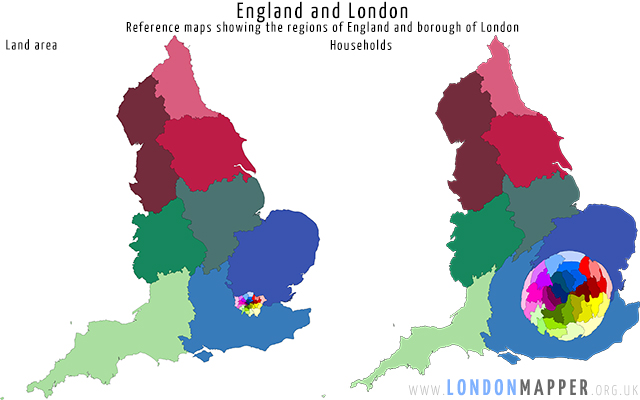
The map below shows the regions of England and boroughs of London each coloured separately. The population cartogram next to it shows the very same areas, but now with the area drawn in proportion to the population so London becomes much larger. We use these cartograms because they highlight just how dramatic the changes have been in term of actual numbers of extra household who are now poor or wealthy and from which areas all the households in the middle have disappeared in greatest numbers.
The three cartograms below are sized: firstly by the number of additional poor households living there between 1980 and 2010, an additional 2.8 million across all of England and Wales; secondly by the decline in the number of households who are neither rich nor poor – a fall of 0.5m across the country almost all of which has been concentrated in London; and thirdly the rise in wealthy households of which there has ben an increase of 1.7m over the course of the last generation, the roughly 30 year period 1980-2010.

These dramatic changes have resulted in the distribution shown in the next three maps for 2010 where London now has the smallest proportion of households who are neither poor nor rich. Nationally some 49 per cent of households are now in the middle, but in London that proportion is now 37 per cent, in 1980 it was 65 per cent, some two in three households in London used to be in the middle; today that proportion is shrinking towards just one in three London households being neither rich nor poor; some 36 per cent being poor and around 27 per cent being asset rich. It is London that has experienced the most dramatic change in all of England.

Figures for Wales are included in the table above but not mapped here and like most of the regions of England they show much slower change but still a social polarisation occurring. We did not calculate estimates for Scotland or Northern Ireland.
The changing patterns of rich and poor within London
The cartograms below shows each borough of London drawn with is area in proportion to the number of households who were rich or poor in 2010. It is worth noting that although all the maps are drawn with the same overall area here there are far more poor household in London than wealthy households. The cartograms are like pie charts showing the share of the proportion of each group in each place. A greater share of London’s poor still live in the centre and east of the capital than on the outskirts; but these distributions are changing as the sizes of the groups also change.
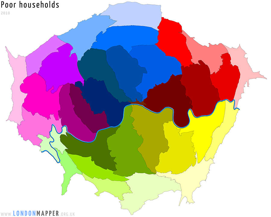
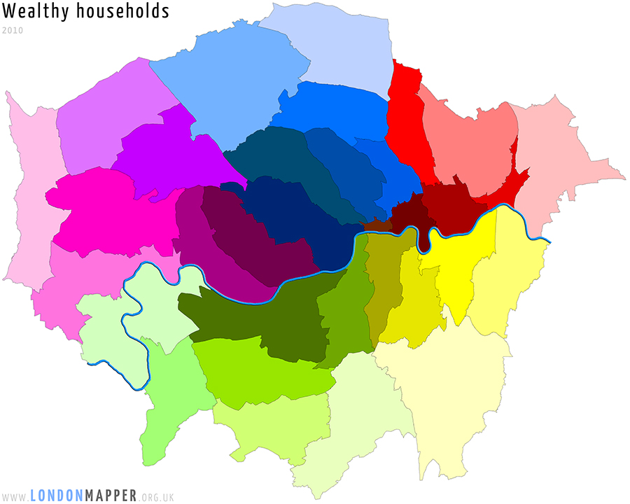
Wealthy, poor, and households in the middle are found living in all the boroughs of London but the proportions have changed rapidly in recent decades. If we colour the two maps above by the proportions of households that are wealthy and poor in each borough it is clear to see that the poorer households are still concentrated in Inner London, towards the East while large numbers of richer households are found in much higher numbers in three parts of Outer London. Many of the richer households may not consider themselves to be that rich, but their net equity today means that they are very wealthy compared to most people living in Britain.


The final two pairs of London maps show which parts of the capital have had the largest increases in the proportions of households that have now poor or wealthy. Poverty has grown in the East, but also just North and West of the centre of London. That growth in poverty is partly hidden by the growth in wealth of many other households living in the same areas. Similarly the growth of wealth within many areas of the centre of London, as well as the South West can be obscured by growing rates of poverty in the centre.


The map of London shown below is perhaps the most important. It shows how much of the decline in households in the middle has occurred in each borough between 1980 and 2010. The largest falls in the proportions of households that are neither wealthy or poor has been in outer boroughs.


The largest fall in households in the middle has been in Westminster, 40 per cent (percent point – one percentage minus another) fewer in 2010 as compared to 1980. The largest increase in wealthy households has been in Richmond, a 32 per cent rise in 30 years, an extra three out of every ten households; and the largest percentage point increase in poverty has been in Newham, where almost one out of every two households are now poor, making Newham the second poorest borough in London to Hackney.
Notes: www.londonmapper.org and for specific poverty statistics over time; page 14 of this report.
Content from our partners


Related


